Assessment: Is your website dressed for success?

In B2B marketing, being clear about “what you do” and “how you are different” are foundational components for considering your company’s brand and central to how you present yourself online. But what else factors into consideration? Other things to think about include design, organization, use of graphics, and social proof.
A valuable website visitor (oftentimes an analyst/manager role) will be focused on researching potential B2B enterprise vendors with the goal of providing a short list of 2 to 4 vendors to the decision makers/budget holders who they want to include in the sales process (RFP).
Will the decision maker first ask for a sales meeting? A demo? At some point, maybe – but their first gut-check will be done on vendor’s websites.
What are they looking for?
Important Cues:
Having determined they found a vendor that appears to address their business problems, a key criteria determining whether they recommend a vendor to management for consideration, is credibility. Whether formally defined or not, credibility is often informed by a handful of cues. When combined, these cues send signals that will create an impression and start to separate the more credible vendors from the less credible.
These cues answer: “is the website:
- Well designed – (consistent branding & aesthetic visual language)?
- Well organized, with meaningful content (clearly addressing the needs of researchers, influencers, and decision makers in support of the end to end buyer’s journey)?
- Using graphics as aids (vs crutch)? Here we are not looking for animation for animations sake, or big cinematic photography for the sake of impact, but rather are the visuals used to underscore, clarify, make the content more inviting to read, are animations being developed and used for the express purpose of helping visitors understand a complex concept, etc
- Clearly establishing social proof that respected enterprise brands are already successful using their solution (no one wants to be the guinea pig)?
There’s little greenfield at any given moment in the B2B enterprise tech space, so it’s pretty likely you will be competing against some well entrenched, mature players.
Say you were evaluating a new marketing automation platform for a 1,000 person company, vendors may include ubiquitously known players such as Marketo, Pardot and new organizations such as ActiveCampaign. It’s important to note here that well-known players do not have to “prove” credibility on their websites as their brands are well known and established, however, lesser- known solutions like ActiveCampaign might have to work harder to earn validation and credibility from stakeholders who were not previously aware of them.
A key goal for lesser known brands, is to telegraph to all prospect roles (researcher, influencer, decision makers), that their brand is every bit as capable, professional, and worthy as the industry leaders- that one would feel confident they’re not wasting anyone’s time including them in RFPs and be compared side by side.
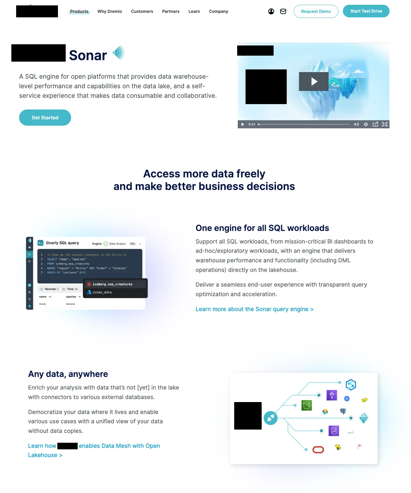
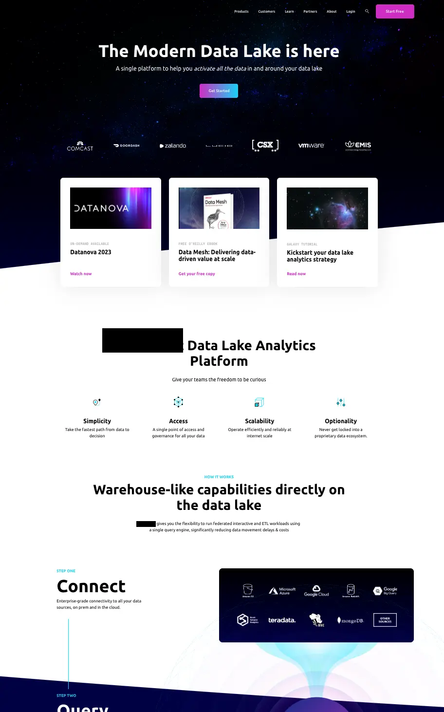
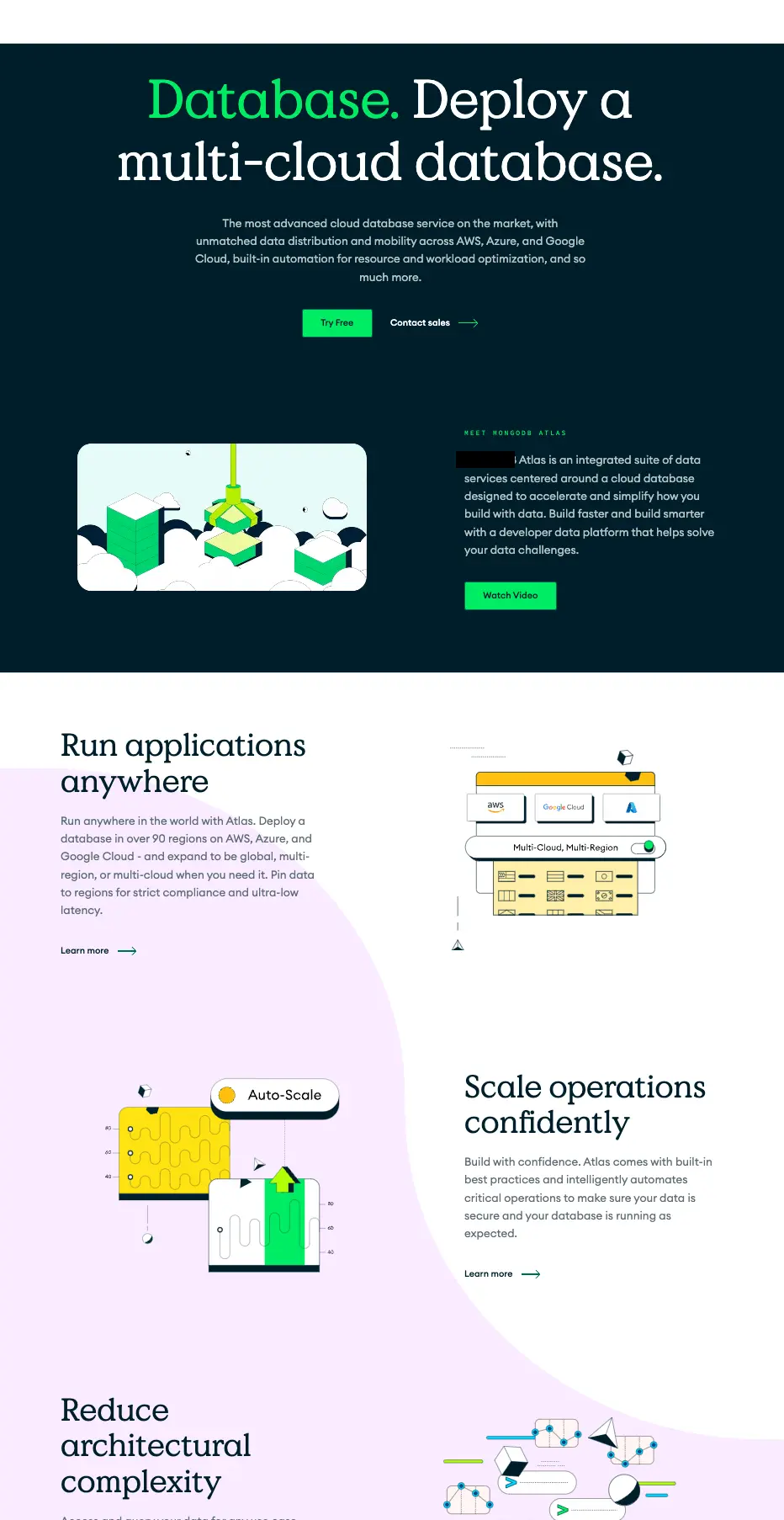
By way of illustration, below are a group of actual vendors in the data analytics category. Assuming you were on the buying committee. What is your first impression from the three?
Assuming they all provide essentially similar benefits and features – does any one give you more confidence than another? Look more mature? Buttoned up?
A

B

C

Using the cues as a rubric for evaluation:
Having just touched the surface to validate comfort with potential vendors, we form more opinions through experience as we go deeper. While we did not replicate the sample vendors’ entire web page, we did look deeper to get a sense of credibility and asked ourselves: How do the cues we established earlier shape our opinions/perspectives?
- Well designed – (consistent branding & aesthetic visual language)
- We see a distinct difference between brands A&B and brand C. Brand C has a well established and distinct visual language and aesthetic and is applied consistently and projects a more mature image. Brands A & B “appear” less mature, more start up.
- Well organized- , with meaningful content (clearly addressing the needs of researchers, influencers, and decision makers in support of the end to end buyer’s journey)
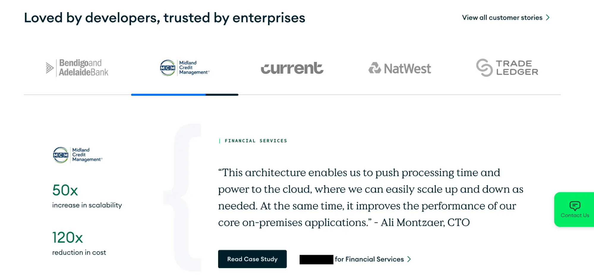
- Brands A and B spent most of their homepage real estate focusing on their product/solution. Brand B asks us to read other material before fully explaining what they do – however, Brand C provides more of “story”, providing a high level overview of the solution, before intentionally addressing credibility highlighting company stats featuring their size, scope, and scale, well known customer’s quotes that validate their solution, case studies to help readers better understand how a solution is successfully implemented.
- Use graphics as aids (vs crutch). Here we are not looking for animation for animations sake, or big cinematic photography for the sake of impact, but rather are the visuals used to underscore, clarify, make the content more inviting to read, are animations being developed and used for the express purpose of helping visitors understand a complex concept, etc
- All three brands did a reasonable job of using graphics to support their content. Brand A started their page with a video explainer. While having a video is not a bad idea – leading with it on the homepage may not be (remember, prospects are scanning to get quick bites of data to validate you as a vendor – asking them to stop and watch a 3min video is not what they want to do at this early stage). It was clear brand C was more intentional with their design to highlight the important elements covered in their graphics (vs more of a ppt slide you need to study)
- Clearly established social proof that respected enterprise brands are already successful using their solution (after all, no one wants to be the guinea pig).
- Here again, brands A and B did not address this at all on their home page, whereas brand C went out of its way to address this. Both by using customer examples through direct quotes and case study offering, but also with a logo listing of large, well respected clients.

Why does this matter? It’s about getting a chance vs no chance at all
Our quick evaluation of the 3 vendors above (often conducted subconsciously) has already established a pecking order. Remember it’s most likely there would be a larger group of brands being evaluated for the shortlist. In our case, brand C has already established a clear advantage in the competition to be included in an RFP.
If the 4, th, 5th, and 6th brands delivered on the credibility factors with the same efficacy as brand C – where does that leave brands A and B? They may get knocked out of consideration.
The power and payoff of action
But what if Brand A decided to address this shortcoming? What if they made a small investment in design, organization, graphics, and social proof? They now have a better fighting chance to be considered. Changing just 1 mind would more than cover the investment and effort. And the dividends would continue to pay out.