Analyzing the ‘Request a Demo’ Page: Unpacking Why Conversions Are Lagging

Why is your ‘Request a Demo’ page experiencing a slowdown in conversions? To address this, let’s explore the environments where demos are most effectively delivered: in-person, such as in meetings and trade shows.
In real-world scenarios, when a prospect requests a demo, do you immediately launch into the presentation? or While at trade events (scanning a badge might be standard) would you ever respond to a live demo request with:
“Great! Before I show you the demo, I’m going to need some information from you. Please fill out the next 8 fields of information and when you’re done, we can get right to it.”
Why don’t we do this? because prospects will likely say “never mind” and move on. Because this would add unnecessary friction to what should be a high-value engagement with someone who is serious about considering your solution.
The Friction That Comes with Requesting a Demo Online
The whole “Request a Demo” experience online creates friction in the user experience. Upon clicking the “Request a Demo” button – prospects are served a page that now (basically) asks the prospect “are you sure you want a demo?” Essentially serving up a reason for them to bail or change their mind. Every bit of friction almost invites online prospects to say “never mind” and bounce.
Key Insights and Actionable Steps for Success
Five steps to minimize friction and boost conversions on your ‘Request a Demo’ page.
- Do the homework – understand your demo persona – Not all of your target personas will engage in a demo. These will often be practitioners looking to solve a very particular problem or looking to improve workflow. Isolate the most important things these specific personas are looking to validate via a demo and be sure you are delivering.
- Reduce the number of required fields from your form. Optimize your form by limiting it to 4-5 fields. Utilize backend resources like ZoomInfo or Demandbase to enrich contact data, eliminating the need to ask prospects. If additional information is necessary, consider progressive profiling. Every required piece of info eliminated translates to one less point of friction in the user experience.
- Provide a concise overview of the demo’s purpose and objectives (justify the value of their time). Highlight how your demo will address the specific pain points and challenges of your target persona. Use strong language that resonates with these influencers. The page should clearly convey what you will cover in the demo and the pains you will address (not what the benefits of your product are).
- Validate your solution via social proof. Unless you are a clear top of mind market leader, prospects will want to know you are already a proven entity (and that they are not your test subject). Including customer logos or known company testimonials on this page goes a long to build trust and comfort that they are not wasting their time and will be more willing to proceed.
- Personalized messaging and targeting. hen possible. Personalize the page content to specific target personas. Use dynamic website customization tools like Mutiny or Optimizely to display personalized information based on visitor behavior or segmentation. Remember people are asking themselves “do I really want to share my contact info” ? (knowing full-well they will quickly get 5 calls from an SDR and be bombarded with emails.) Make it easy for them and psychologically keep it simple. Minimize as much friction as possible to make the experience as it might be when asked in person.
Real world examples
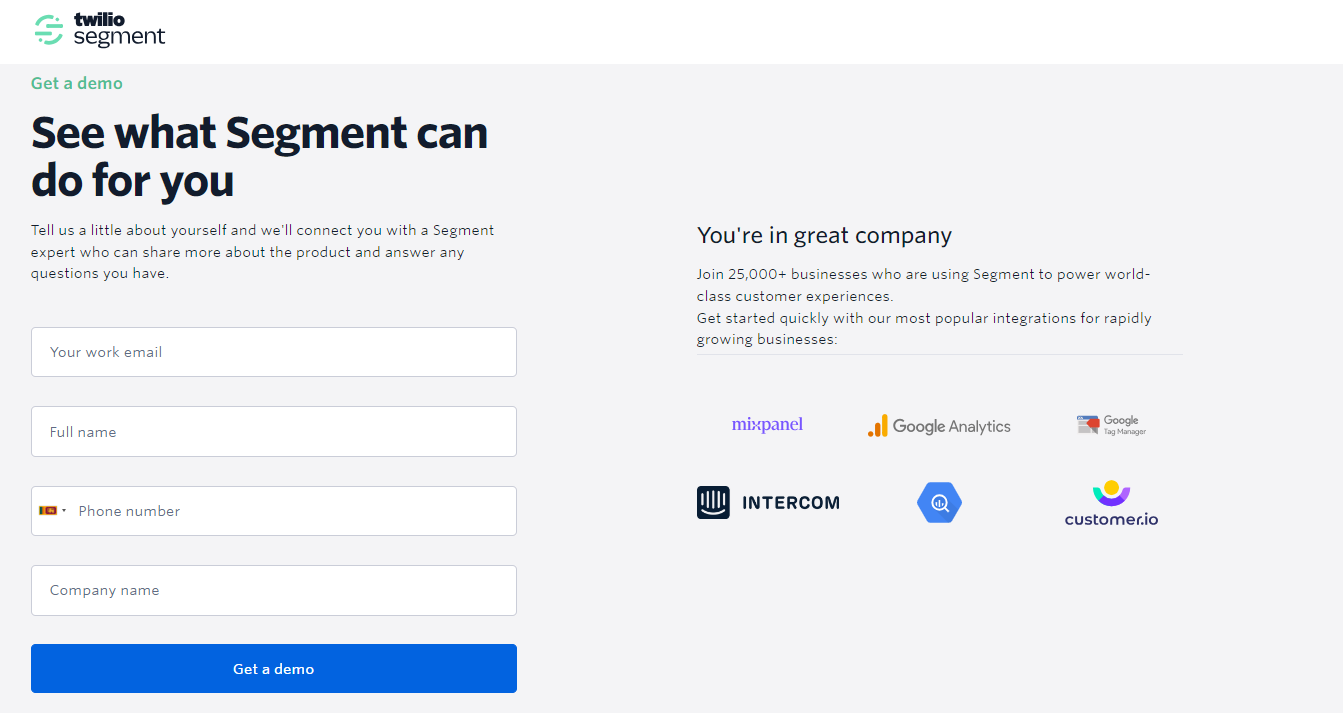
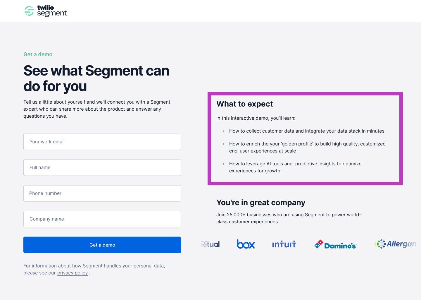
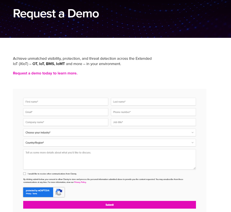
Let’s dive into two real ‘Request a Demo’ pages and analyze what they did well and where there’s room for improvement.

What They Did Well:
- Clean, Inviting Design: A visually appealing layout can enhance user experience, making it more likely for visitors to engage with the content.
- Limited Form Fields to Fill: By limiting the number of forms fields to four and reducing the information required upfront, they’ve mitigated potential friction and encouraged more visitors to proceed with the ‘Request a Demo’ page.
- Good Social Proof: Testimonials, or logos create a sense of trust and reliability, influencing prospects positively toward the product or service.
What They Could Do Better:
- Present an Outline of What will be Covered During the Demo: Clearly articulating what visitors can expect to learn or gain from the demo would provide transparency and manage expectations. Everyone’s worst nightmare is going to a generic demo that doesn’t cover what they were looking to understand.

Another crucial consideration is that prospects are not primarily interested in your product’s features and benefits. They are focused on addressing their pain points and seek to understand how your product can effectively resolve them. Therefore, the demo should not merely be to showcase product functionality but to illustrate how it addresses the prospect’s pain points.

What They Did Well:
- Clear CTA in the Header: Having a clear Call to Action (CTA) prominently placed in the header allows visitors to immediately understand the primary action they are encouraged to take.
What They Could Do Better:
- Set Expectations Clearly: Providing a brief overview of what a prospect can specifically expect from the demo, such as use cases covered, insights shared or features highlighted, would enhance transparency and manage expectations better.
- Reduce Number of Entry Fields: The current form includes nine fields, and we propose reducing it to four or five. This streamlined approach increases the chances of visitors completing the form, ultimately boosting conversion rates. We advocate for simplifying the initial interaction by requesting only essential information. Asking for industry, region, titles, and discussion topics may not necessarily enhance the conversation or demo experience.
- Add Social Proof: Incorporating social proof, such as client testimonials, case studies, or success stories, can significantly enhance validation and instill confidence in prospects.
- Personalize Content: With the company’s emphasis on discrete industries, customizing the ‘Request a Demo’ page by industry could add an extra layer of validation. Our recommendation is to tailor content and customer logos to specific industry sectors. This approach demonstrates a profound understanding and relevance, further persuading prospects that their time investment is worthwhile.